ASOS HOMEPAGE REDESIGN
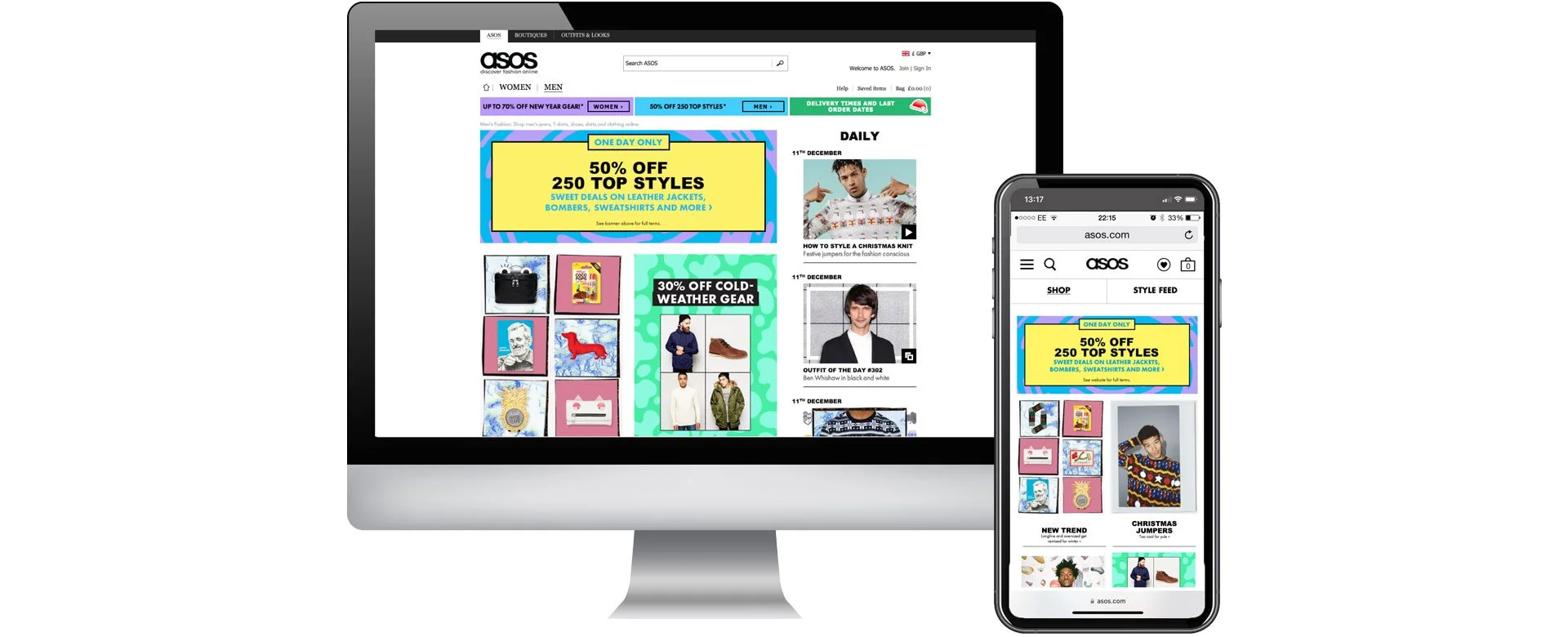
Working closely with the key stakeholders, the UX team, and PMs, we redesigned and migrated the homepage onto a CMS and introduced a new editorial section of the website. Taking the menswear homepage from initial brainstorms and wireframes to the execution of the new concept. The design needed to be flexible to accommodate the ad hoc changes coming from business requirements and marketing priorities.
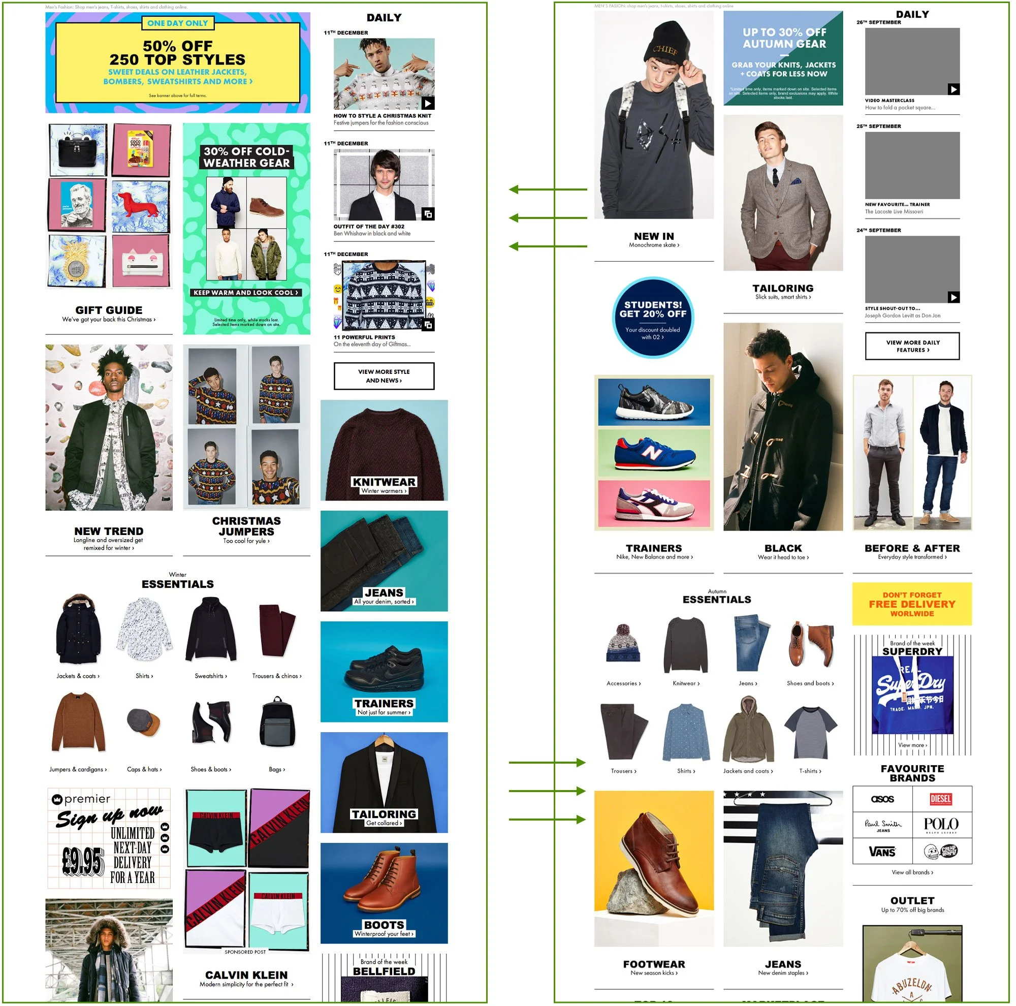
I devised a fluid module-based layout, that allowed the editors to easily move things around the page depending on priority changes, and scheduled homepage refreshes. We had modules for:
→ Sale
→ Promotions
→ Essentials
→ Key brands
→ Key moments
→ Key categories
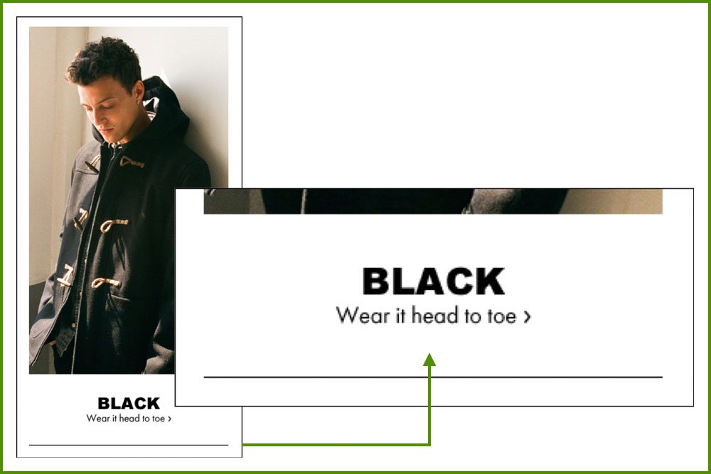
The title is large and bold to draw attention. Subheading must end with “ › “ style arrow. (Extensive research shows that people are drawn to clear indications of the actions they need to take: click/ tap)

The new editorial feed on the homepage includes dates to show off regularity and build up a readership. The date is offset to create a tab-like visual.
PHASE TWO
↓
PHASE TWO ↓
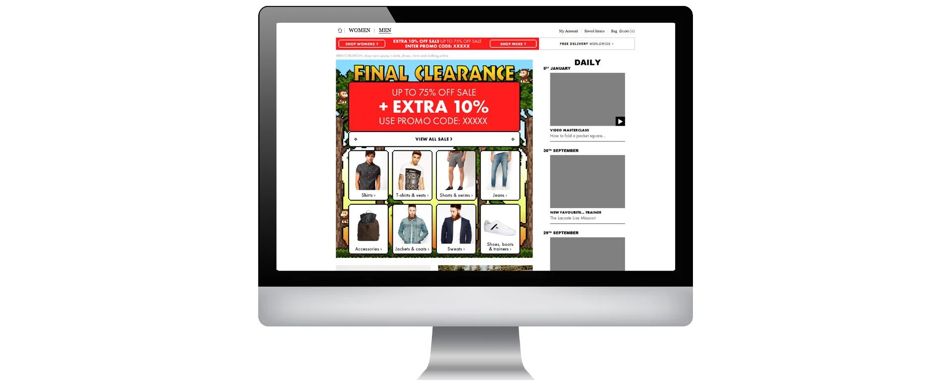
The sale component comes with various requirements:
→ It needs to be adaptable from desktop to mobile and tablet.
→ It has to work across markets, with translations and different lengths of text.
→ It must show a clear change in step as the reductions increase over 6 plus weeks.
→ 8 key categories must be clearly displayed with an additional ‘View All’ button.
The module design successfully allows us to do the above and reskin the module for future sales.
SALE COMPONENT


PHASE THREE
↓
PHASE THREE ↓
SALE CREATIVE
SALE CREATIVE
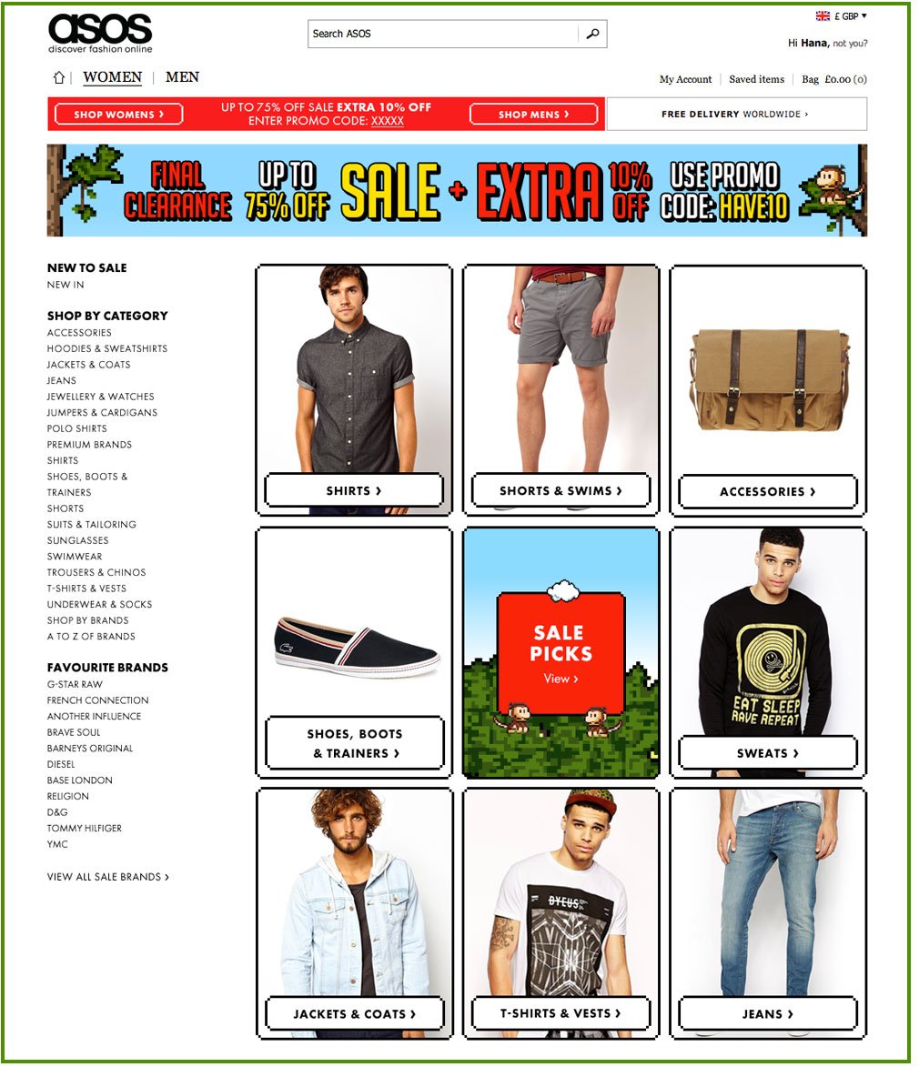
With each ASOS sale, the creative would change. An example of a design I put together many sales ago. Across menswear and womenswear, we pitched a computer game idea that would allow us to show a step change as the discounts increased.
Working with a middleweight designer, a junior designer, and an art worker, we designed 4 different computer game designs. Creating a library of fonts, colours, backgrounds, and characters for each.
The graphics were tweaked to suit each customer touch point and translated across the international sites.


